Flavors of LA
Visual Identity & Logo Design
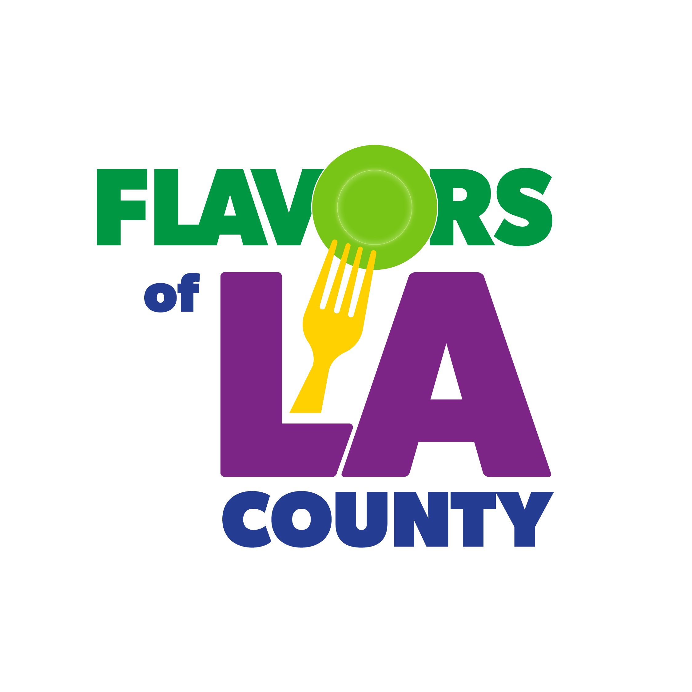
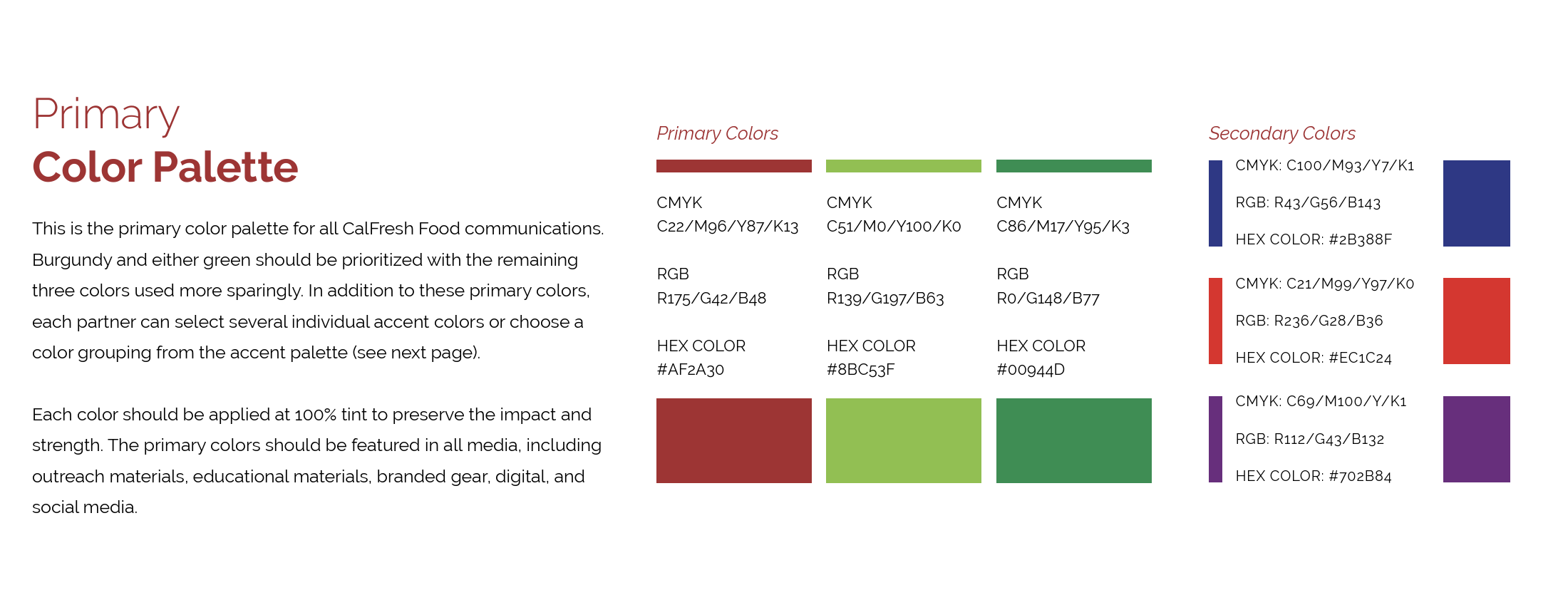
Developed the foundational logo and expanded it into a cohesive visual identity system designed to represent the richness and diversity of Los Angeles neighborhoods. The identity was crafted to feel dynamic and vibrant while remaining flexible enough to scale across multiple neighborhood expressions.
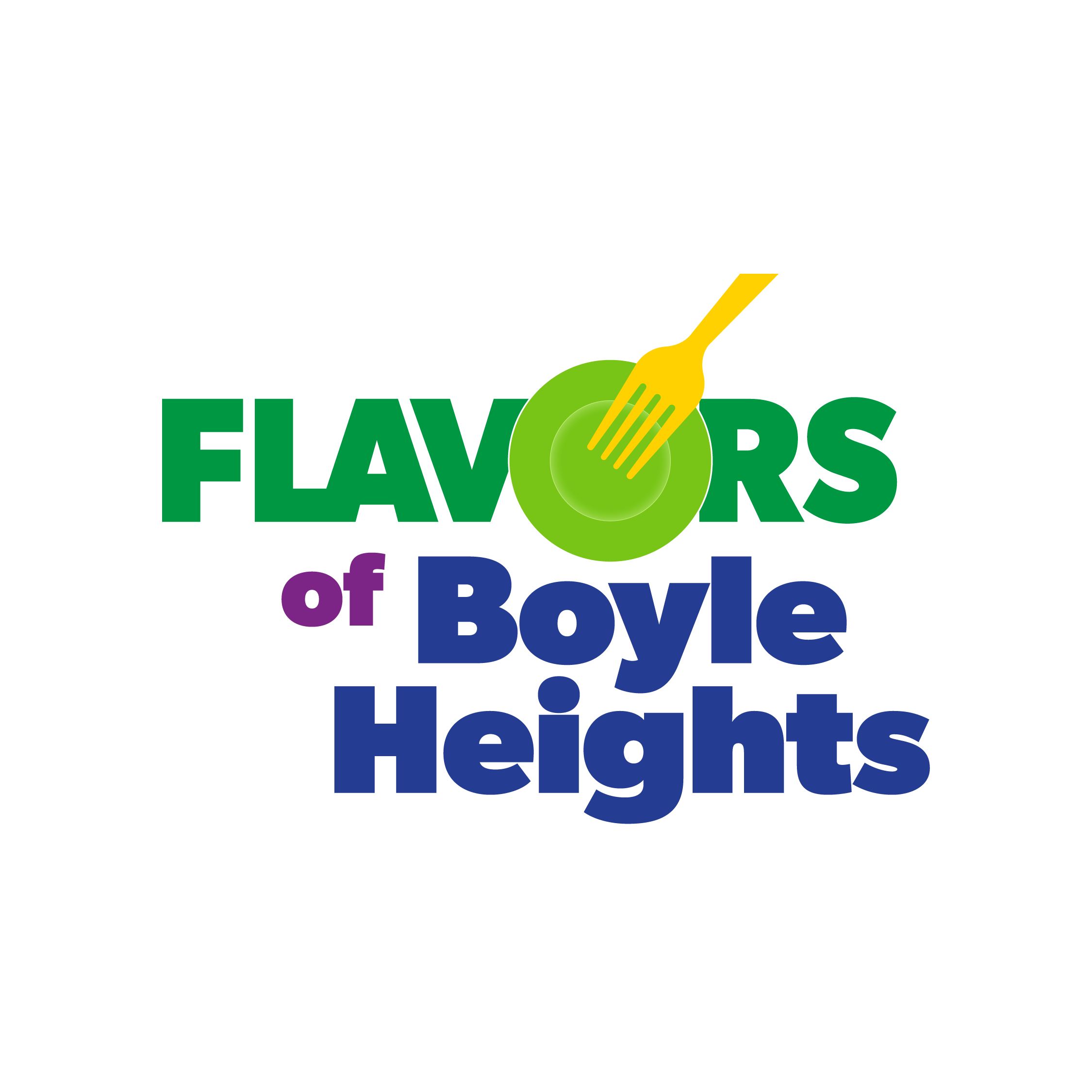
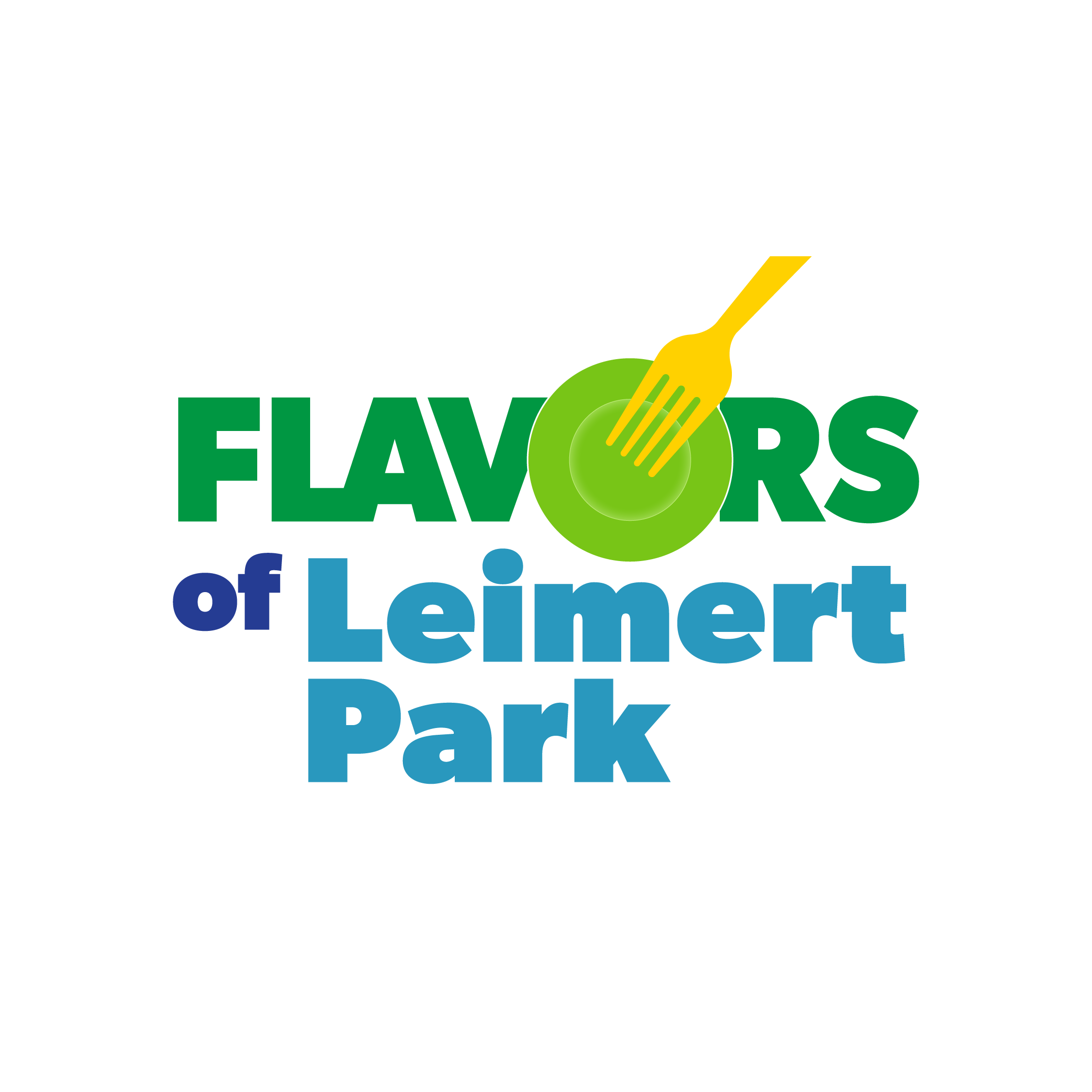
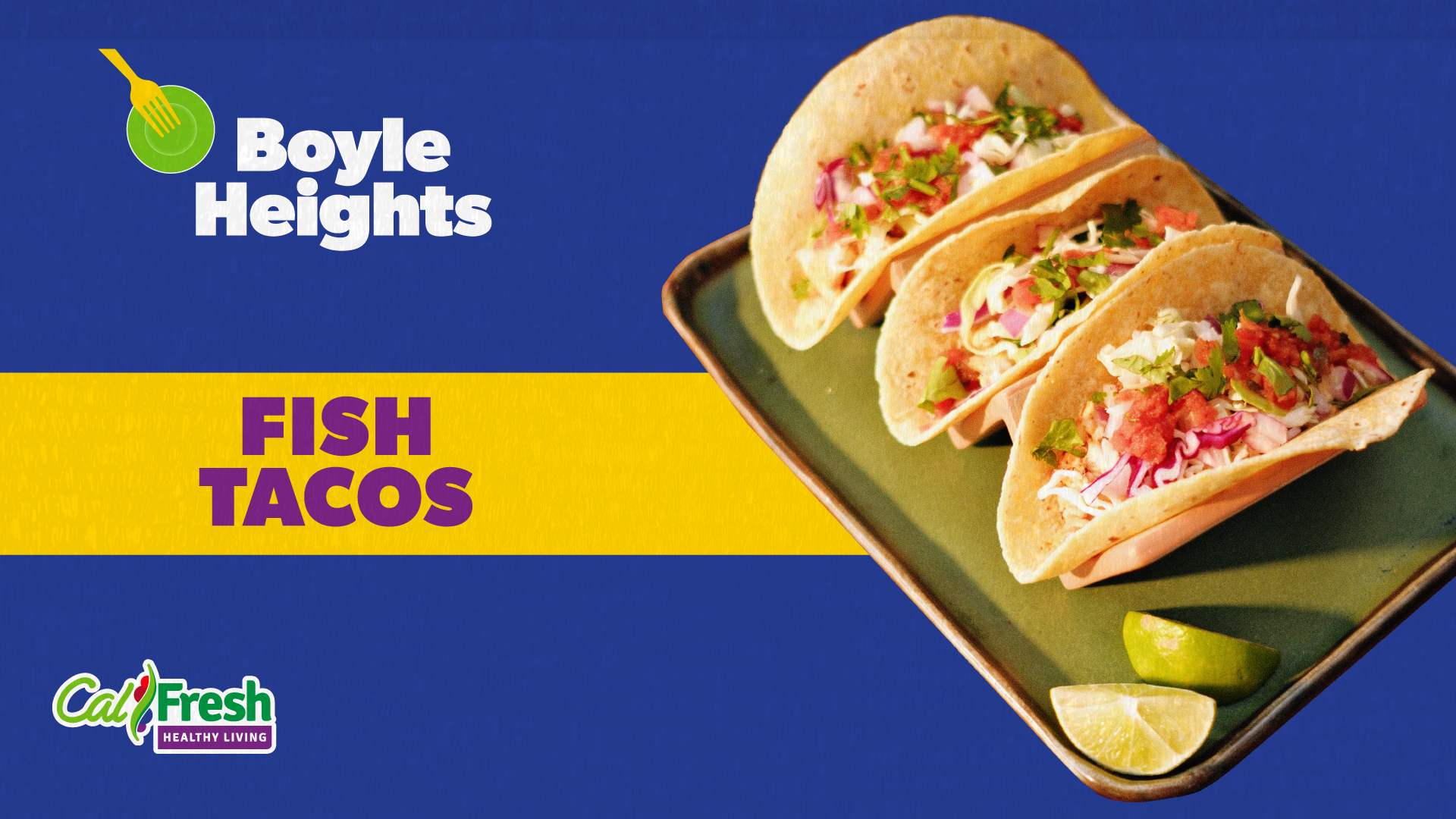
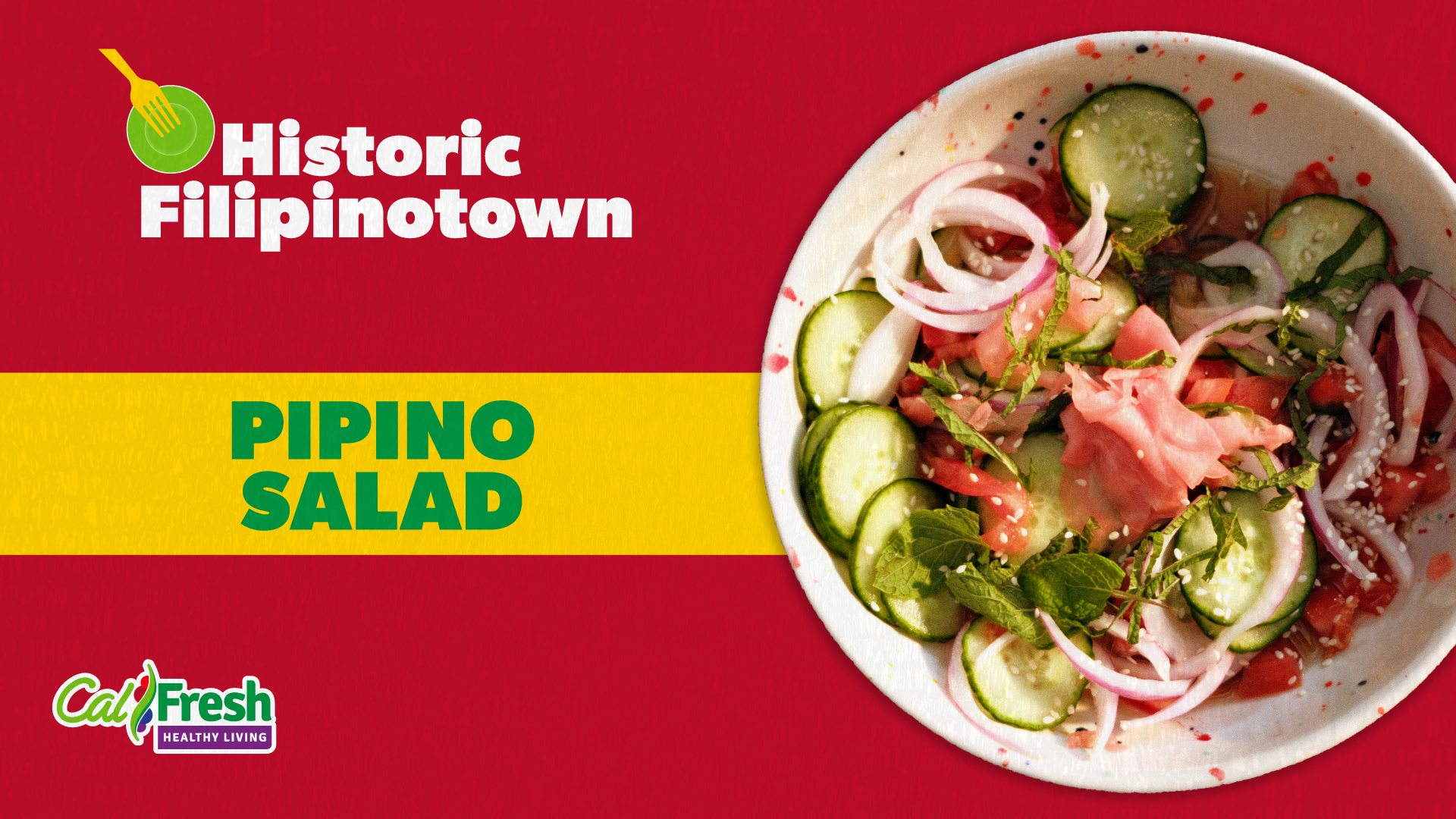
Building on the primary logo, created a system of neighborhood-specific marks that maintained visual consistency while allowing each area to express its own character.

In addition to the static identity, directed the visual graphics and overall aesthetic direction for accompanying video content.
While I did not produce the videos themselves, I established the visual language, motion style, and graphic direction to ensure consistency across all touchpoints and reinforce the brand system
(Intro cards, outro cards, thumbnails ).


The result is a flexible, scalable identity system that unifies multiple neighborhoods under one cohesive visual framework while allowing each to maintain a distinct and authentic voice. By carefully balancing consistency with variation, the system supports individuality, creating a strong overarching brand while honoring the character of each community.