BrightLife.Kids:
case study
BrightLifeKids came to life with the opportunity to build a brand from the ground up, one that could connect with families in a meaningful and emotionally engaging way. From the start, the goal was not just to create a visual identity, but to shape a brand that could grow with its audience and show up consistently across every touchpoint resulting in progressive registration goals.
Objective: Launch and scale a cohesive brand presence across organic and paid social, while building a strong foundation that could extend into print, digital, and out-of-home and reaching registration goals.
Approach: I led the creative direction from concept through execution, partnering closely with a copywriter to develop a unified visual language and tone of voice. We crafted a brand that is warm and approachable; clear, trustworthy that feels authentic.
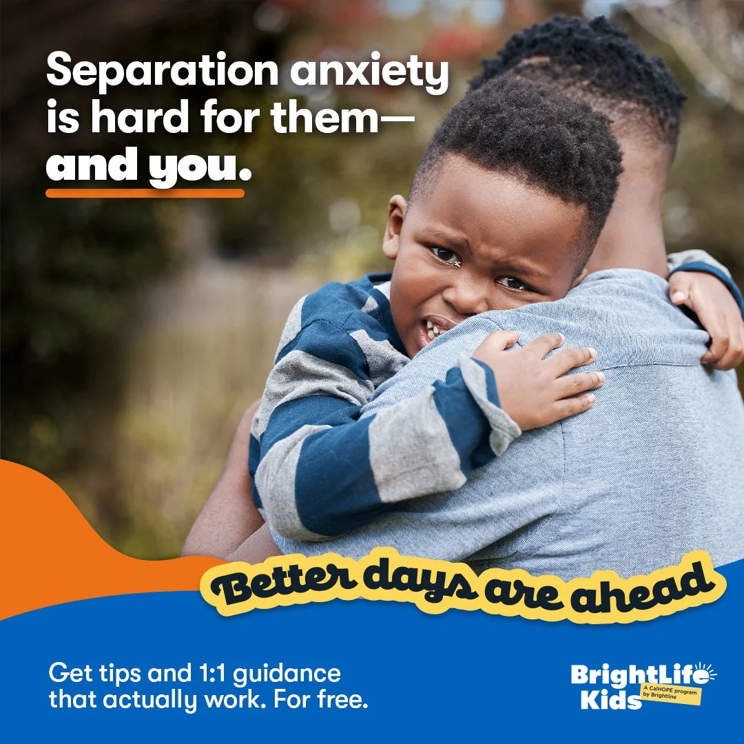
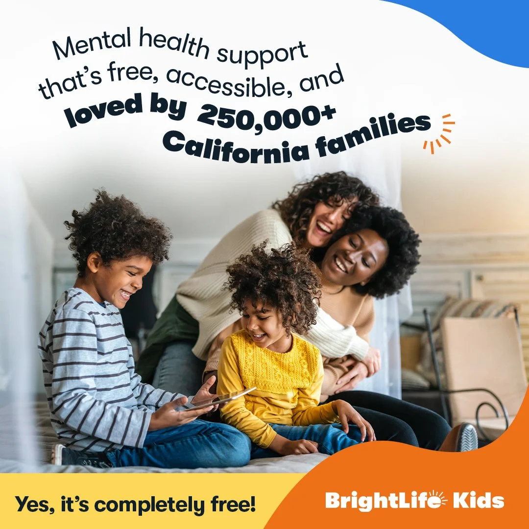
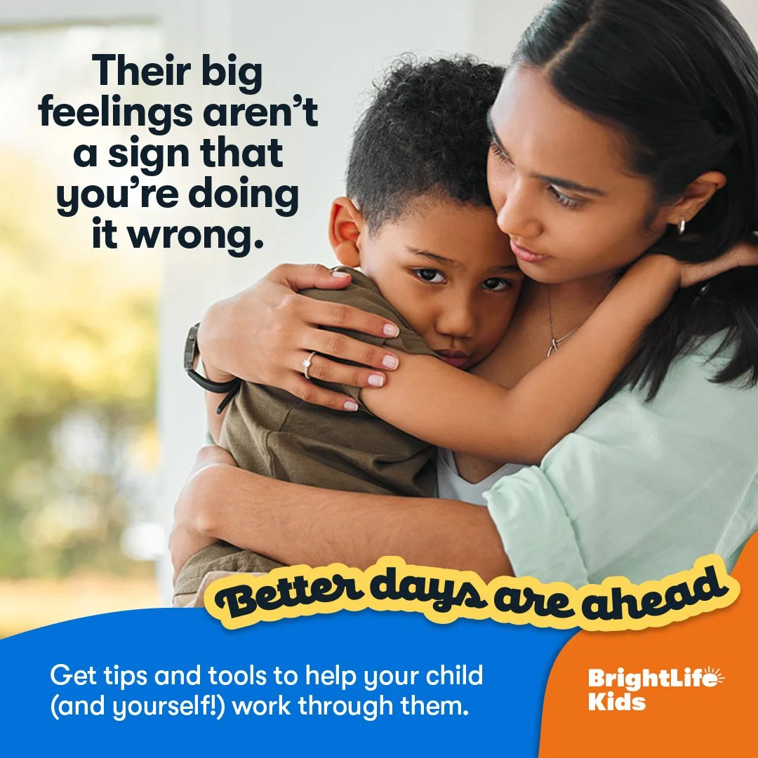
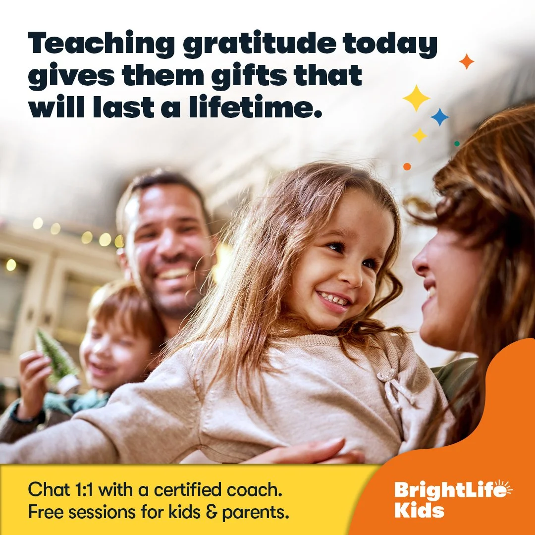
Insight: Parents respond to brands that feel both reliable and human. The opportunity was to create a voice and visual system that balanced clarity with authenticity, something that could educate, connect, and build trust over time.
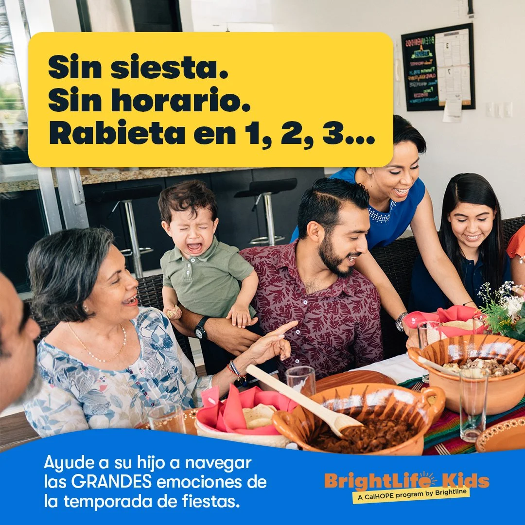
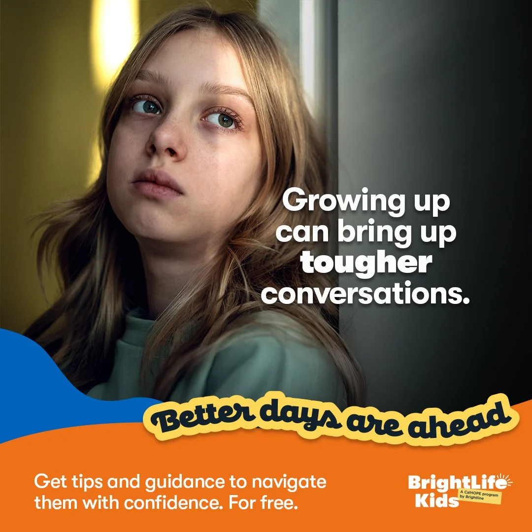
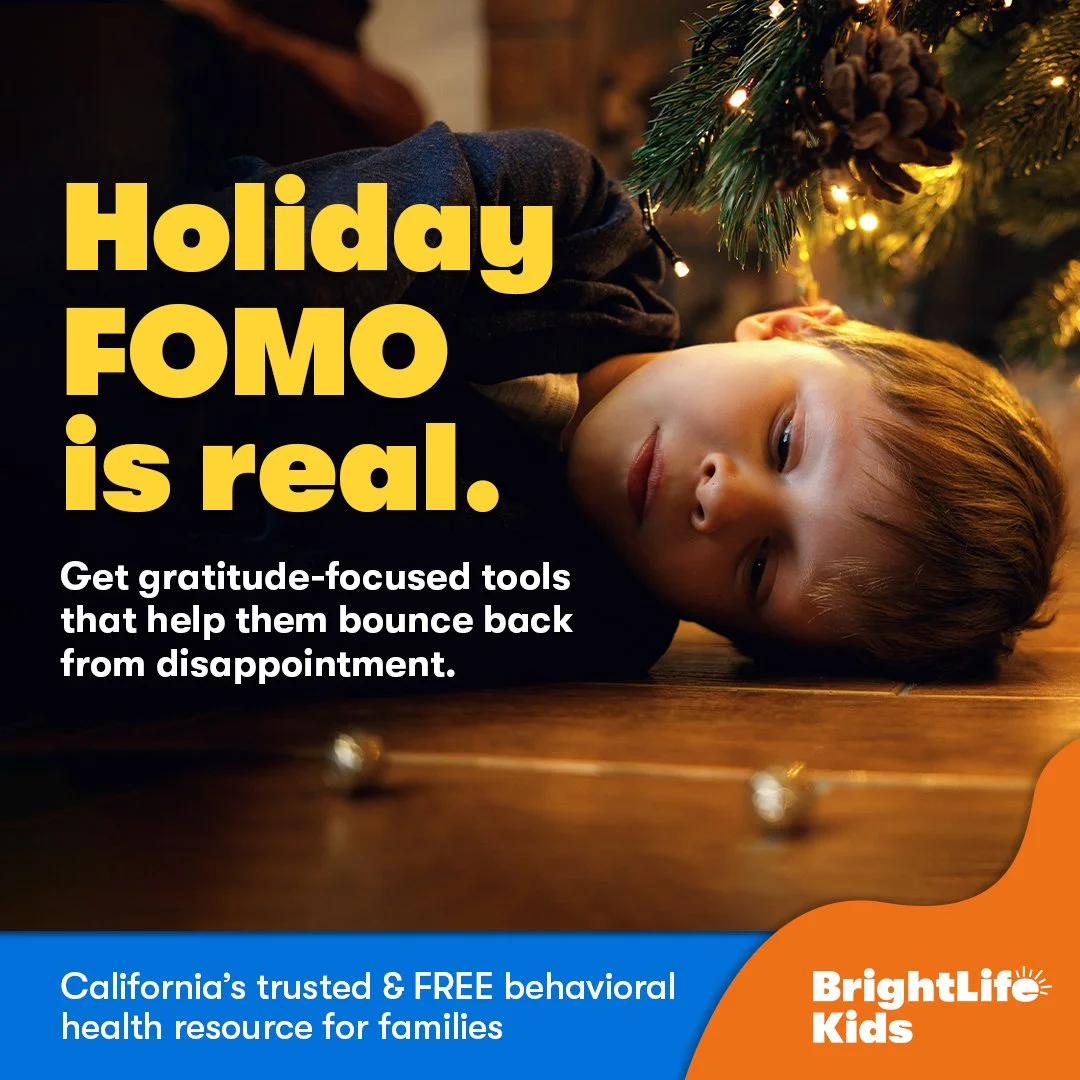
The creative direction centers around clarity, warmth, and consistency.
Visually, the system uses a clean, approachable typography, a bright yet controlled color palette, and simple, structured layouts that prioritize readability.


The brand was designed as a flexible system from day one.
I developed guidelines and frameworks that allowed the identity to scale seamlessly across organic social content, paid campaigns, print collateral, digital experiences and out-of-home placements. This ensured that as the brand grew, it remained cohesive and recognizable.


Over the course of two years, BrightLifeKids evolved into a fully realized brand with a clear identity, voice, and scalable visual system.
The work drove measurable growth, generating over 5 million website visits and more than 300,000 registrations, while establishing a strong and consistent presence across social, digital, print, and out-of-home.
Beyond performance, the brand now has a solid foundation for continued expansion.


A brand built with clarity, scaled with intention, and proven through results.

Building brightlife kids from the ground up was about more than branding, it was about building meaningful connections. Through collaboration and a consistent creative strategy, the brand grew into a trusted presence, driven by strong design, clear messaging, and data-informed decisions.